Review and Reflection
This project initially started much bigger than it actually ended. Simplifying ideas is, however, a normal aspect of a creative process. Initial idea to create a printed strategy guide was reduced to the creation of six pamphlets. I realized the need to simplify the project shortly after the mid-term critique. There are many areas that can be covered in Death Rally game but as far as it is a racing arcade game, description of cars would create the most important section of the strategy guide. I, therefore, decided to take this path, stick with cars and create a pamphlet for each of the car.
These pamphlets contain plenty of information and details about every car from the Death Rally game. Plenty of game data have been collected throughout the time, which resulted in creation of nine, well thought, tables. It took a lot of time to gather the data and create the final tables. It was definitely worth the time because it helped me during the final stages of my work. Information from eight tables was directly used within the pamphlets. In the end, many different kinds of information can be found on the pamphlets. Technical information, strategy information and also recommendations are present in the final texts.
Writing was the most difficult part of this project. It required a very good knowledge about the subject as well as good writing and interpretative skills. Even though, I have known the game for 15 years, I still had to start it several times during my writing sessions in order to check if the information, I was about to use, is correct. I split writing into three weeks in order to be able to read it again and correct mistakes. I have written more than 2000 words in total.
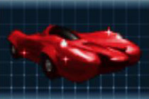
I have spent many days taking screenshots from the game in order to get some visuals. Thanks to that I became more familiar with the Fraps software, which allowed me to take as many screenshots as I wanted without the need to exist the game every time a screenshot was taken. I also broadened my Adobe Photoshop skills while adjusting, manipulating and combining images from the game. There are several images on each pamphlet. The one closest to the tile, the name of the car, is the best image that could be taken from the game. Image, containing four different views on the car, was created by combining four separate screenshots. Small images showing different levels of damage had to be taken right during the race, as far they indicate the damage status.
I have spent last three weeks putting all the pictures, articles and data together, using Photoshop, in order to create the final pamphlet design. I spent a lot of time searching for the most suitable font for each one of the cars. Titles, in combination with images of the cars, create six unique identities. I am quite happy about the final result. I believe I managed to find fonts that, in different ways, represent the characteristics of the car. I also spontaneously discovered some design elements I like to use more than others.


